Happy Plant Mobile App
Role: Lead UX Writer
Tools: Web Browser, Facebook, Reddit, Google Sheets, Google Docs, and Whimsical
Overview
Happy Plant is an app that helps users care for their plants. It’s a fictional app designed by the UX Writing Hub for their UX Writing Challenge. My role involved researching the target users, developing a persona for Happy Plant, and designing 3 variants of an empty state frame to test with target users.
The Problem
Gardening is hard, especially for beginners. Gardeners often express their frustrations with seeds that don’t grow into the thriving plants they anticipated. They go online and ask for guidance, but the information isn’t always helpful.
Happy Plant was conceived as an app to help gardeners care for their plants. When I came onto the project as the lead UX Writer, there was no style guide or defined persona for Happy Plant. As a non-gardener myself, I had no knowledge of gardening lingo or how gardeners sound. To write effective content for Happy Plant, I realized I had to learn how to write to and as a gardener.
Users
Gardeners with various levels of proficiency and experience.
Process
1. Conducted Research: To help me write content that resonates with novice and experienced gardeners, I employed the method of social mining by browsing gardening websites, forums, product reviews on Amazon, and social media groups to discover the terms and phrases gardeners regularly use. I recorded these terms and phrases with their sources in a Google Sheets file so that I can refer to it and apply those terms in my interface copy. Social mining not only helped me learn gardening lingo, it also helped me empathize with gardeners’ wants, needs, and pain points. Investing a lot of their time and energy into caring for a plant that doesn’t flower is a major pain point.
2. Defined the Style: The information I gleaned about gardeners’ lingo, needs, desires, and frustrations helped me create a style guide and give Happy Plant its persona. Check out my style guide by clicking on the image below:

Click on the image to view the style guide.
3. Designed Content: After completing the style guide, I was tasked with creating the empty state screen for new users. The empty state needed to encourage users to add plants from their physical gardens into the Happy Plant app. When no longer empty, the screen would display all the plants a user input. The user could then select one of the plants, and Happy Plant would teach them how to care for it. Tapping the button would lead to a search bar for users to enter and select their plants to add to their libraries, or digital gardens. I created 3 variations of the empty state screen to conduct A/B testing on the content.

Empty State Variations
4. Tested the Content: In order to ensure that my copy is easy to understand and the calls to action are logical, I recruited coworkers, family, and friends to be my testers. My main goal was to ensure that testers knew what might happen if they tapped the primary or secondary buttons. I also wanted to find out whether testers found the copy clear, easy to understand, and encouraging.
Before testing the copy with testers, I determined that if users had downloaded Happy Plant from an app store, they would expect the app to require them to input the plants in their garden so that the app could teach them how to care for them. So I thought it was important to provide testers with relevant background information, and I created the following scenario to present to them:
“You visit the app store looking for a gardening app. You come across an app that teaches you how to care for the plants in your garden. The app description says that you can tell the app what plants you have in your garden, and the app will teach you how to care for your plants properly. You download the app, open it, and see this screen.”
After ensuring that my testers understood the scenario, I asked them the following questions:
Presenting Screen A (far left): What happens after you tap the button “Add First Plant”?
How does the content make you feel?
Presenting Screen B (middle): How does the content here make you feel?
Presenting Screen C (far right): How does the content here make you feel?
What happens when you tap “Get Suggestion”?
Highlight your favorite screen, or your favorite heading, body, and button? Explain your choice(s).
Results
All test subjects expressed that the copy on all 3 screens was clear and easy to understand. They all understood that tapping Add First Plant and Add a Plant leads them to inputting a plant into the app library. They also understood that tapping Get Suggestion on Screen C would lead to some kind of survey for the user to answer so that the app could suggest a plant.
The majority of testers highlighted Screen C, indicating that it was their preferred version of the screen, because of the Get Suggestion button. While one tester found the body and buttons on Screen C to be most encouraging, they indicated that the heading on Screen A felt most encouraging to them.


Since the majority of testers preferred the body and buttons of Screen C, I decided to use those, and the more encouraging heading from Screen A in my final design.
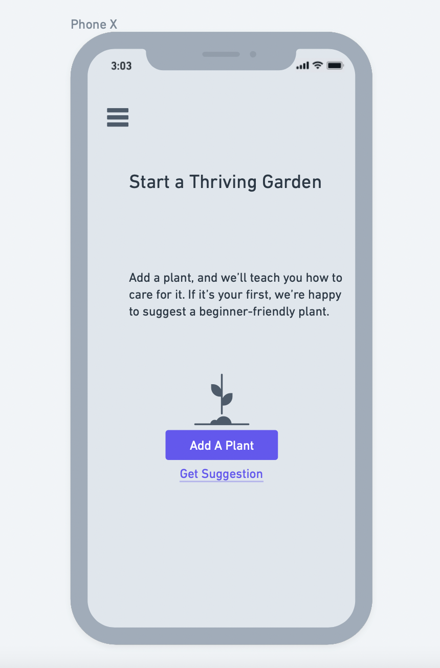
Final Empty State Screen